Guide #4: ANALYZE
Data Analysis and Reporting
Reflect on and analyze the data you have. Identify trends, and then turn your data into metrics and summary reports
At this point in the guides, you have reviewed why farmers market primary data matters, which metrics you want to use, how to collect data from your market, and how to enter it into a spreadsheet or into another database.
In this unit, you’ll learn how to organize the data into tables and create reports. These reports and metrics directly feed into Guide 5: Share, which will help you get your market’s story out to your target audiences.
Analysis is the process of identifying patterns and correlations within raw data, and then translating them into usable information. Analysis can answer some important questions like “How is this market benefiting vendors?” or “How are attitudes, behaviors, and knowledge changing as a result of the market?”
Approach to data analysis may vary, depending on who is leading a research effort. Like everything else about a farmers market, a collaborative and open process works best, and the same is true when examining data. The responsibility for analyzing data can be shared with university researchers or municipal or agency partners. When working with partners, markets should retain ownership of their raw data and ask for author credit for all analysis and reporting or at a minimum, to be acknowledged as the partner of the research team.
This unit describes a few key methods of data analysis that you might consider using, including the following:
- understanding data frequencies
- coding qualitative answers
- understanding the basics of using and reporting averages.
Organizing Data for Analysis
Frequency Tables
When you review the responses to the data collection at your market, you will find that the easiest way to analyze the responses is by creating frequency tables. Guide 3 covered how to enter and manage the data in spreadsheet form. The next step is to use your spreadsheets to create useful charts and tables, like a frequency table. This is simply a way to organize the collected data so that the repeated responses can be noted and analyzed.
There are generally three columns in a frequency table (see Figure 4.1 below):
- Column one typically lists the specific responses provided. These may be multiple choice answers, or yes/no/not applicable, or a scale that respondents used to rate their answer. In some cases, respondents may be allowed to answer more than one question.
- Column two shows the number of times a particular response was chosen. This number is the frequency of the response.
- Column three shows what percentage of the total responses that number of responses represents.
Q1. How many times have you shopped at this market this year?
| Responses | Frequency | Percentage |
|---|---|---|
| Weekly | 256 | 40% |
| Twice a month | 134 | 21% |
| Once a month | 57 | 7% |
| Once or twice a season | 63 | 10% |
| This is my first visit | 127 | 20% |
| Non-responses | 10 | 2% |
| N | 647 | 100% |
Figure 4.1. Sample Frequency Table
The total number of respondents (people who completed the question) is called the “N.” It is important to know this number and to know how many people you asked the question. If for example, you asked 100 people and only 5 answered (extremely unlikely in markets) then your N = 100 and your response rate would be 5%, which is lower than is usually required (usually a 10-15% response rate is the minimum required as covered in Guide 2.)
Remember, not everyone will answer your questions, which is a non-response. Other people will answer your questions but in an inappropriate way (especially if the question is not clear). We code those inappropriate answers as ineligible responses. There were no ineligible responses in this graph.
If your question allows only one possible response and no overlap in answers, then the responses to that question are nominal data. As the name suggests, there is a name or label for each response that you have selected, as shown in Figure 4.2 below:
Nominal Data Frequency Chart
This is how to ask the question to collect nominal data.
| Nominal Question: | How often do you shop at this farmers market? |
| Nominal Responses: | Weekly Twice a month Once a month Once or twice a season This is my first visit Other? |
A frequency table for this type of question is fairly straightforward. The total number of people who selected each answer is listed, along with the percentage of all respondents that number represents. Another way to collect nominal data is presented in Figure 4.3.
Q. How many times have you shopped at this market this year?
| Responses | Frequency | Percentage |
|---|---|---|
| Weekly | 256 | 40% |
| Twice a month | 134 | 21% |
| Once a month | 57 | 9% |
| Once or twice a season | 63 | 10% |
| This is my first visit | 127 | 20% |
| Other? | 10 | 2% |
| N | 647 | 100% |
Figure 4.3. Nominal Data Frequency Chart Example Two
You may also have a question that asks respondents to rank a defined list of items. That is a widely used type of question for market data collection. Ordinal questions are typically used to capture the relative importance of opinions or preferences. In these types of questions, the respondent is typically required to assign one number or rank for each item listed. An example is presented in Figure 4.4 below.
| Ordinal Question: | Please rank the following modes of transportation based on how frequently you use one or more to come to market. |
| How to answer: | Please use 1 for the least frequently used, and 5 for the most frequently used. |
| Ordinal Responses: | Driving Walking Public Transportation Bicycling Carpooling |
Creating a frequency table for an ordinal question is a little more involved than creating tables for nominal questions because each respondent will have multiple answers, since you are asking them to rank all of the possible answers. In our example question in Figure 4.4 above, each respondent will provide five answers.
In this case, the question is listed, along with the N or total number of respondents. Then, for each response, all of the rankings are added up, giving a total. The response with the greatest total would be, on the whole, more frequently used. In addition, you can calculate the averages or means for all the rankings and include them in the table. Although averages do not tell the whole story and may skew the data, they give you a general sense of how your respondents ranked the options given. The way in which this data can be examined is presented in Figure 4.5.
Q: Please rank the following modes of transportation based on how frequently you use one or more to come to market. Please use 1 for the least frequently used, and 5 for the most frequently used.
| Respondent ID | Driving | Walking | Bicycling | Public Transportation | Carpooling |
|---|---|---|---|---|---|
| A | 3 | 2 | 4 | 5 | 1 |
| B | 4 | 2 | 3 | 5 | 1 |
| C | 5 | 4 | 1 | 2 | 3 |
| D | 5 | 1 | 3 | 4 | 2 |
| E | 2 | 4 | 1 | 1 | 5 |
| Total | 19 | 13 | 12 | 17 | 12 |
| Average score | 19/5 = 3.8 | 13/5 = 2.6 | 12/5 = 2.4 | 17/5 = 3.4 | 12/5 =2.4 |
Another example of an ordinal question asks farmers market visitors to indicate how likely they are to shop at an outdoor winter market on a scale of 1 to 5, with 1 being “not at all likely” and 5 being “extremely likely.” If the combined responses average less than 4.0, the market might want to delay launching a winter market, or ask visitors the same question at a later time when it has more details, such as hours and location, for them to consider before responding to the question. This type of question is presented and the way in which the data can be examined is illustrated in Figures 4.6 and 4.7 below.
| Interval Question: | How likely are you to shop at an outdoor winter farmers market? |
| How to answer: | Please respond on a scale of 1 to 5, with 1 being “not at all likely” and 5 being “extremely likely.” |
| Interval Responses: | 1 “Not at all likely” 2 3 4 5 “Extremely likely” |
Q. How likely are you to shop at an outdoor winter farmers market? Please respond on a scale of 1 to 5, with 1 being “not at all likely” and 5 being “extremely likely.”
| Responses | Frequency | Percentage |
|---|---|---|
| 1 “Not at all likely” | 35 | 16% |
| 2 | 52 | 24% |
| 3 | 15 | 7% |
| 4 | 47 | 22% |
| 5 “Extremely likely” | 65 | 30% |
| N | 214 | 100% |
Figure 4.7 Interval Question Responses with Frequency Data and Percentages
Frequency Tables for Questions with Open-Ended Responses
Open-ended questions are those that provide a blank space where respondents are asked to offer an answer. Open-ended questions are well suited for messy “opinion” or “attitudinal” questions in which the responses can be far more nuanced than those captured by a multiple choice question. In addition, they work well for “feedback” type questions in which you provide a place for people to express themselves and be heard, sometimes completely independent of the purpose of your research project.
Open-ended questions can be either quantitative (“How many crops did you sell at farmers markets in 2015?”) or qualitative (“How did you decide which crops to grow in 2015?”).
Examples of open-ended quantitative questions include:
Q. How many acres are you actively farming in 2015? Include all land, including any that is leased or owned. _________________________
Q. Total sales $__________ for the 2015 market season.
In these cases, the responses will present a wide range of numbers. There are three ways to create a frequency table for responses to this question. One option is to list every single number that was given as a response, show how many people gave the same number (your frequency), and calculate your percentages. This approach produces a long table, but it provides complete transparency about the data.
A second option is to provide a numerical summary of the most basic statistics, including the total, average per respondent, median, range, and the total number of respondents (N). Let’s look at an example of this type of analysis in Figure 4.8.
Q. How many acres are you farming in 2015? Include all land, including any that is leased or owned.
| Acres Farmed in 2015 | |
| Total acres | 960 |
| Average | 15 |
| Median | 36 |
| Mode | 18 |
| High | 80 |
| Low | 2 |
| N | 64 |
Figure 4.8 Open-Ended Quantitative Question
The third option for creating a frequency table that can manage a question with a number for the response, such as acres or sales, is to create categories. This is cleaner, but it requires a decision about how to create the categories.
One standard way is to divide into even categories, usually quarters (25%) or quintiles (20%). Or you could create the categories based on the responses and work more inductively. Either way your frequency table will have responses, frequencies, and percentages. It is important to document that the categories were created at the time of the report and not presented as part of the question. Compare Figures 4.9 and 4. 10 below to see how the same set of data looks when presented using different categories.
Q. How many acres are you farming in 2015? Include all land, including any that is leased or owned.
| Responses | Frequency | Percentage |
|---|---|---|
| 1 to 7 acres | 16 | 25% |
| 8 to 22 acres | 16 | 25% |
| 23 to 52 acres | 16 | 25% |
| 53 to 80 acres | 16 | 25% |
| N | 64 | 100% |
Categories created by D. Guru on 8/2015.
Figure 4.9 Open-ended Quantitative Question with Four Categories – A
Q. How many acres are you farming in 2015? Include all land, including any that is leased or owned.
| Responses | Frequency | Percentage |
|---|---|---|
| Under ten acres | 19 | 29% |
| 11 to 25 acres | 14 | 22% |
| 26 to 50 acres | 14 | 22% |
| Over 50 acres | 17 | 27% |
| N | 64 | 100% |
Categories created by D. Guru on 8/2015.
Figure 4.10 Open-Ended Quantitative Question with Four Categories – B
If you have data from a survey or questionnaire, it is customary to report the frequencies in the same order in which the questions were asked.
Coding and Reporting for Open-ended Qualitative Questions
Here’s an example of an open-ended question included in a dot survey completed at a Rapid Market Assessment at the Port Angeles Farmers Market in Washington (see Figure 11). In addition to the “dot” responses, there was an open-ended item at the end of the survey. The single word “Suggestions?” was posted at the top of the page, along with a couple of big pens hanging on the easel. After transcribing what people wrote, the market staff saw the following themes emerge:
- Desire for longer market hours
- Ideas for infrastructure improvements (tables, heaters for winter markets, recycling)
- Desired products, top five in order of frequency (coffee, produce in smaller amounts for single people, more fruit, chicken, more sausage/meat)
- Call for more events and activities
- Positive comments on market location
- Continuing canine clash (5 in favor of and 8 against allowing dogs at market)

The final frequency table in the summary report for this market is shown below in Figure 4.12:
| Coded Themes | Frequency | Percentage |
|---|---|---|
| Desire for longer market hours | 113 | 46% |
| Ideas for infrastructure improvements at the market (more tables, heaters for winter markets, recycling) | 41 | 17% |
| Desired products at the market, top five in order of frequency: coffee, produce in smaller amounts for single people, more fruit, chicken, more sausage/meat | 36 | 15% |
| Call for more events and activities | 10 | 4% |
| Positive comments on market location | 7 | 3% |
| Continuing canine clash (5 for allowing dogs, 8 against) | 13 | 5% |
| Other responses | 28 | 11% |
| 248 | 100% |
Figure 4.12 Frequency Table for Open-ended Dot Survey Question
Coding and reporting the responses to open-ended qualitative questions takes more time than reporting the results of questions with closed-ended responses. Coding also requires a bit of practice and it is more open to interpretation. Consequently, it may be advisable to be strategic about how many qualitative open-ended questions you choose to include in your survey, questionnaire, or dot survey.
For more extensive survey work, software exists that researchers use to code qualitative written comments. For our purposes, a simpler approach can work.
- Step 1. Transcribe the written responses to the question. Resist the temptation to correct spelling.
- Step 2. Read through all the responses before starting to do any coding. This way you get a full sense of what people said.
- Step 3. Brainstorm the general themes or topics in the responses, using the exact words of the respondents.
- Step 4. Count how many times each theme comes up. Keep in mind there may be and usually are more than one theme in any given response.
Coding can be done in Microsoft Excel or other spreadsheet applications. In Excel, paste all the transcribed responses in a column, with one response per row, starting in Row 2. Then write the brainstormed themes along the top in Row A, each atop a new column. Sift through the responses row by row, putting an X (or whatever mark works for you) in the appropriate columns if the response includes that theme. You can then do a quick count in Excel to reveal how many times each theme appears.
- Step 5. Step back and review your themes based on the content. Can some themes be combined? Do some need to be divided into more than one theme? Try to be as objective as possible. For the tables, these themes need only be preliminary. However, once a theme or category of responses is “on paper,” it can become harder to change. Keep in mind that an outlier or response that is unusual either in frequency or content or both is usually worth paying attention to. Is this the new idea you’re looking for? Or is it a new understanding, or just a random response that you can disregard?
- Step 6. Rank the themes by the frequency of responses.
- Final step. Report the exact question (as in the other frequency tables) and your top five or ten responses. Do not provide an exhaustive list at this time. But do note that this was an open-ended question that has been coded so that your readers know that the respondents didn’t simply select one of the listed “answers.”
Averages: Mean, Median, Mode, and Ranges
Once the data has been organized, the biggest question remains: what does this mean? In other words, what patterns and trends do you see? What’s missing? What have you learned? What new questions do you have?
One of the ways to approach these questions is to do some basic calculations with the numeric data in your summary report’s frequency tables. The three most basic calculations of averages are Mean (what most people know as an Average), Median, and Mode. Each of these calculations has a role in reporting your market metrics. In addition to the mean, median, and mode, it can be helpful to report and look at the range: the difference between the lowest and highest values among all responses collected.
The Mean is the most familiar and common of these calculations. To calculate the mean, add together all the numerical responses to a question and get the Total. Then divide by the Total by the Total Number of Responses. See the formula below:
Total of All Responses / Total Number of Responses = Mean
The Median is the middle number in a series of numbers. The number that is in the dead center is the median. Half the numbers are higher than the median, and half are lower. (If there is no middle number, the average of the two middle numbers is the median.) The median is especially helpful to look at when you have responses that are all over the map (i.e., sales, income, acres, age).
The Mode is the number (or value) given as a response to a question that appears most frequently. Imagine looking at your results and counting how many times each number (or value) was the response to a question. The number that appears the greatest number of times is the mode. You can also think of it as the most popular number.
Trend Reports
In addition to creating your summary report and doing some further calculations with your results, you may also want to look at and report trends. Trend reports examine changes over time. Technically, a trend report is also called longitudinal research. Activity can vary market hour to market hour, market day to market day, month-to-month, season-to-season, and calendar year to calendar year. Regardless of the length of the time period measured, the principles of creating a solid trend report are the same.
Remember: you must collect exactly the same information (or data) during each time period that you want to compare.
For example, if you want to compare the number of vendors who sold at your market in 2014 to the number who sold at your market in 2015, you need to collect the number of vendors for 2014 and for 2015. The trick is to make sure you mean the same thing by “number of vendors” every time you collect this information. Do you mean anyone on your market roster who sold at your market, even if it was just for three weeks? Or do you mean just the vendors who committed to the entire season or were selling during your peak season? Do you include all vendors or just farmers? Do you count community booths, each unique group or just how many were at each market?
As you can see, even a simple thing like a vendor count can get messy. That’s why you must be sure to write down, every time, exactly what information was collected, how, when, and by whom, so that you can be consistent throughout.
Principle two is that while it is helpful to use the same data collection method each time, the key is to collect the same information (or data) each time. And keep good notes. It may be that your market has an attendance sheet by market that is used to document the number of vendors. Or maybe there is a total roster sheet that you use to track vendors at the beginning and end of the season. Over time, one form or data collection tool may end up working better for you. That’s fine as long as the information you end up with is the same for each period of time. And you kept good notes.
A third principle is that there is some data that you can collect each market day and then use to calculate data by month or by season or by year. So you can go from shorter to longer, but you can’t really go the other direction. If you are interested in trends comparing market days, you need to collect data by market day.
Once you have the same data for two or more of the same periods of times (for example, market day, season, or year), then you can create your trend report. Generally speaking, the goal is to see how things changed between these two periods: Did your total sales for the season grow? Or stay flat? Were there more farm vendors in 2015 compared to 2014 or fewer? How did your weekly visitor counts vary over the season?
In order to see any change, some calculations are in order. Step one is to enter the data you want to compare (for the same time period) in two columns. Step two is to calculate the difference by subtracting Value A (the older value) from Value B (the newer value). To calculate the percent change, divide the Difference into Value A. Then, to make it a percentage, multiply the fraction by 100. See Figure 4.13 to see what this looks like in a table.
| Time Period 1 | Time Period 2 | Difference | % Change | |
|---|---|---|---|---|
| Value A | Value B | Value B – Value A | Difference / Value A X 100 | |
| Example 1 | ||||
| 2013 | 2014 | Difference | % Change per Year | |
| Event Proceeds | $15,000 | $20,000 | $5,000 | 33.3% |
| Example 2 | ||||
| October 10, 2015 | October 17, 2015 | Difference | % Change per Market Day | |
| Number of Farm Vendors | 39 | 34 | – 5 | -12.8% |
Markets can measure change over time by collecting data on the same variable (like vendor sales) using the same methods over several years. This information allows a market to say things like “On average, visitors to the market reported spending 40% more in 2014 than they reported in 2013.” Acquiring visitor-reported spending information using the same methods every year will allow the market to conduct this type of trend analysis.
Trend reports are especially useful for a variety of purposes:
- evaluating the results of changes you may have made to the market
- documenting the outcome of grants or other investments
- informing management decisions
- doing long-term planning.
Trend information can also provide evidence to potential partners or policy makers that a market is in a period of growth (or needs investment to grow).
Turning Your Market Data into Farmers Market Metrics
With your data organized, let’s look at some of the most common farmers market metrics featured in this training series. As defined in Unit 1, a metric compares two or more specific units of measurement. Typically, metrics are expressed as {Number of X Data Units} per {Unit of time or space}. For farmers markets, a metric might be expressed as “Total vendor sales per year,” or “Average number of visitors per market day.” A list of possibilities is shown in Figure 4.14 below.
| Data | Unit of Time | Farmers Market Metric |
|---|---|---|
| Total of all vendor sales combined | Year | Vendor reported sales (dollar value of), Vendor sales by currency (dollar value of) |
| Total number of all agricultural acres owned or leased by all market vendors | Year | Acres owned and/or leased by farmers (number) |
| Total number of all food education events | Year | Food education activities (number of) |
| Total number of all volunteer hours | Year | Staffing – Volunteer hours (number of) |
| Number of all SNAP transactions | Year | SNAP-EBT transactions (number of) |
| Total number of all SNAP-eligible goods available | Market Day | SNAP-eligible products available (type) |
| Number of visitors | Year | Visitors (number of) |
| Average spending per shopper | Market Visit | Spending per shopper per visit (dollar value) |
| Visitors ranking of methods used to travel to the market | Year | Transportation to market (method) |
| Average distance in miles traveled from product origin to market (farmer/vendor only) | Year | Vendor distance to market (miles) |
Extended Analysis
Tapping into Existing Databases
Using available databases as discussed in Guide 2 is a great way to expand and make your data meaningful to a large group of partners. This approach compares your market’s data to external data. Health systems and health-related research often use existing databases to inform their research. Economic researchers in particular consider this external data vital to the credibility of any large research project.
However, data on the economic impact of local food system activities must be taken with a grain of salt. Respected food system researchers Ken Meter and Megan Phillips Goldenberg of Crossroads Resource Center recently published the report, “Critical Analysis of Economic Impact Methodologies,” which details how economic impact modeling software does not easily or precisely calculate the positive impacts of local food systems.
Regardless of your source, using existing data requires thoughtful analysis and may entail working with partners to find the most relevant and comparable information to inform your market’s goals and objectives. Markets can seek advice from university partners or agency staff who are experienced in using these databases and can help select specific data points to use for comparison or analysis.
Example: Using External Data to Help Grow Your Market’s Visitor Population
Market A is aware of a growing Latin American population in the region, and wants to attract more market visitors who identify as Hispanic or Latino. In order to set a realistic goal related to this objective (to increase Hispanic visitors by 10% by 2017), it might be useful to use US Census data to see which zip codes and percent of the population those targeted populations represent.
Data may also be helpful to pinpoint the places of origin to be able to create appropriate materials and note culturally appropriate events and products that the market can offer in order to appeal to the target population. During data analysis, the market could compare Census data to the number of Hispanic or Latino visitors in order to gauge the effectiveness of its outreach efforts.
The market might find that in 2013, only 2% of the market visitors identified themselves as Hispanic. In 2014, 7% of the market’s visitors identified themselves as Hispanic. The Census indicates that during both years, 10% of the population living within walking distance of the market was Hispanic. Therefore, the market could conclude that it increased the number of Hispanic visitors, but that there is still room to improve.
Internal Analysis
Market organizations, Boards of Directors, staff, or market advisors have to make decisions about policies, hours, locations, or operating procedures, often aided only by anecdotal information or personal observation. Those decisions are easier to make when informed by data that everyone can see and understand.
Using Metrics to Make Market Decisions
Example A
Market A has some vendors who say their sales have leveled off and may even be falling, compared to previous seasons. They attribute their sales decreases to the addition of new vendors. Other vendors think sales are going up annually. What is going on?
Two metrics could be useful in this scenario. Are the new vendors attracting more visitors? By tracking the average number of visitors per market day the market can answer that question. Further analyzing those numbers in relation to total annual vendor sales to calculate average spending per shopper per market day, a market could better understand how shoppers are responding to the addition of new vendors.
Additionally, collecting daily gross sales figures from vendors and dividing each daily total by the total number of vendors present would offer a weekly snapshot of average sales per vendor. If this average decreases over the course of the season after adding new vendors, you know that the complaining vendors are correct – the new vendors are decreasing per-vendor sales. This trend also shows that it may be time to expand outreach to increase visitor foot traffic, or conduct promotions that encourage existing customers to stay longer and spend more.
Example B
Market B has decided to add a part-time staff position on market day. If the market uses an online volunteer signup or has each volunteer sign in when they arrive and when they leave the market, they can know the number of volunteer hours contributed, and would show how many hours the market currently requires to complete management or outreach duties.
Cross-Tabulations
Cross-tabulation is a simple way to examine the relationship between two nominal variables. Remember that nominal variables are mutually exclusive, like the town or zip code in which you live. The following example demonstrates an exercise using cross-tabulation and allows the market to understand whether single shoppers or groups are more likely to drive to the market in a particular year (Figure 4.15).
| How did you get to the market today? | Number of Responses | Total | % Of Total | |||
|---|---|---|---|---|---|---|
| Single | % | Groups (2+) | % | |||
| Driving | 12 | 39% | 6 | 16% | 18 | 26% |
| Walking | 11 | 35% | 20 | 54% | 31 | 46% |
| Bicycling | 5 | 16% | 1 | 3% | 6 | 9% |
| Public Transportation | 3 | 10% | 7 | 19% | 10 | 15% |
| Carpooling | 0 | 0% | 3 | 8% | 3 | 4% |
| Total | 31 | 100% | 37 | 100% | 68 | 100% |
The table shows that slightly more of the respondents (54%) were in groups and that more than half of all groups surveyed reported walking to get to the market. Twice as many single shoppers as groups reported driving to market.
A more sophisticated analysis might also help the market understand if average spending per visit (a type of ratio scale data) was different depending on whether visitors drove a vehicle or used other modes of transportation to reach the market. If both questions are included on the same survey and implemented at various points throughout the season, a university partner might assist the market in analyzing the raw data in order to identify such a potential trend.
Reporting
There are many ways that data or any information can be packaged and shared. Regardless of your ultimate product, we recommend starting with a basic summary report of your data. The job of the summary report is to answer this question: What did people tell us?
For all reports, it is crucial to provide the basic information about how the data was collected. This record ensures that you can collect the same data in the same way in the future. It also helps your credibility.
Ideally, you should also include as attachments or in an appendix blank copies of the forms, surveys, applications or other data instruments you used to collect the data. If the data collected pertains to a market day or a season, you may also want to note any features such as the weather, what else was going on, etc. Including photos of the process is a great way to document your data collection.
Once your summary report is completed, consider it “preliminary” until you are able to have someone else review it and check your results. In the rush to share, you can sometimes overlook basic errors. Once data is released, correcting it can be a challenge. Taking the time to have someone review every question and formula in Excel can save the headaches of correcting data later.
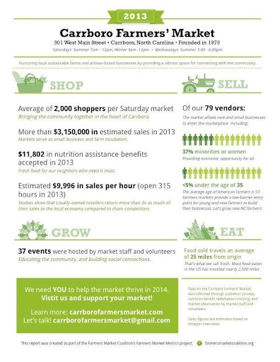
In early 2014, the Farmers Market Coalition collaborated with a small number of selected markets across the country in a pilot project to create a prototype summary report that presented metrics each market had collected.
The summary prototype shows that data does not need to be complex or encased in lengthy reports to be useful or interesting. See Figure 4.16 below for an example of this type of report.
The image below (Figure 4.17) is an example of a social media badge showing data for a metric.

Case Study
Another format useful for reporting market metrics combines data with a narrative, called a case study. This kind of report offers a deeper view of a market’s characteristics and its programs. Case studies are often used in social science research and offer detailed and contextual information about a subject.
References
Greenmarket (2011). Farmers on the Edge. http://www.grownyc.org/files/gmkt/farmers_on_the_edge.pdf.
Meter, K. and Goldenberg, M.P. (2015). Critical Analysis of Economic Impact Methodologies. In Exploring Economic and Health Impacts of Local Food Procurement. Chicago, IL: Illinois Public Health Institute.
Trochim, W.M.K. (2006). Research Methods Knowledge Base, 2nd Ed. Web Center for Social Research Methods at Cornell University. Available at http://www.socialresearchmethods.net/kb/statprep.php.